7 posters · 1686 to 1874
Historical data visualization
The charts and maps that invented data visualization: Halley’s winds, Playfair’s charts, Snow’s cholera map, Nightingale’s rose, Minard’s Russian campaign and Mendeleev’s table.
-
Historical data visualization
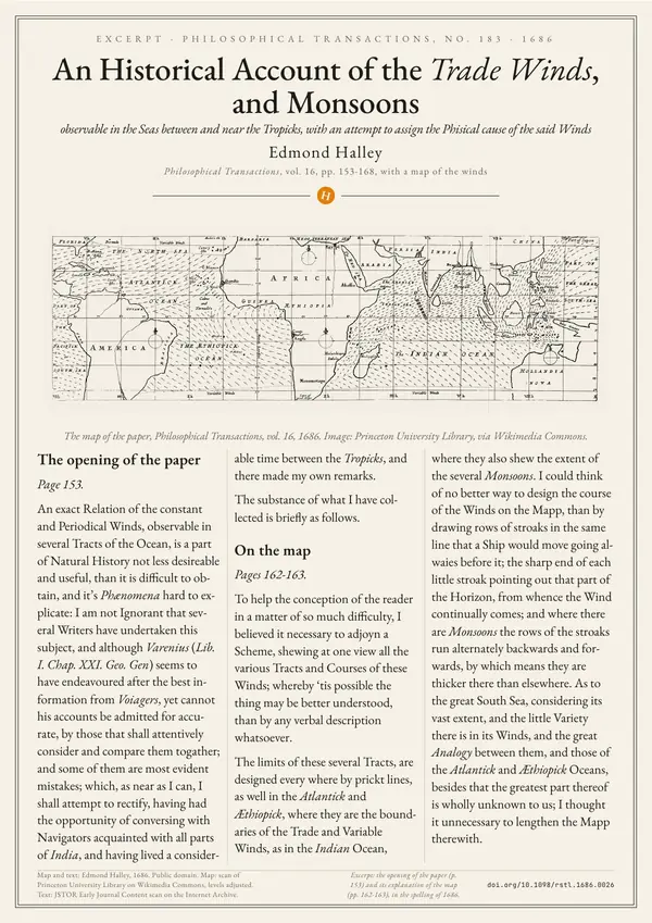
Edmond Halley: An Historical Account of the Trade Winds, and Monsoons
Edmond Halley, 1686
Halley’s 1686 account of the trade winds and monsoons, with his map of the winds between and near the tropics.
Print from A3
-
Historical data visualization
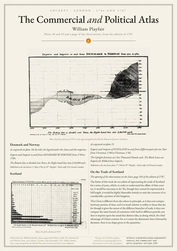
William Playfair: The Commercial and Political Atlas
William Playfair, 1786
Two 1786 charts by William Playfair: trade with Denmark and Norway over time, and Scotland’s trade as bars.
Print from A3
-
Historical data visualization
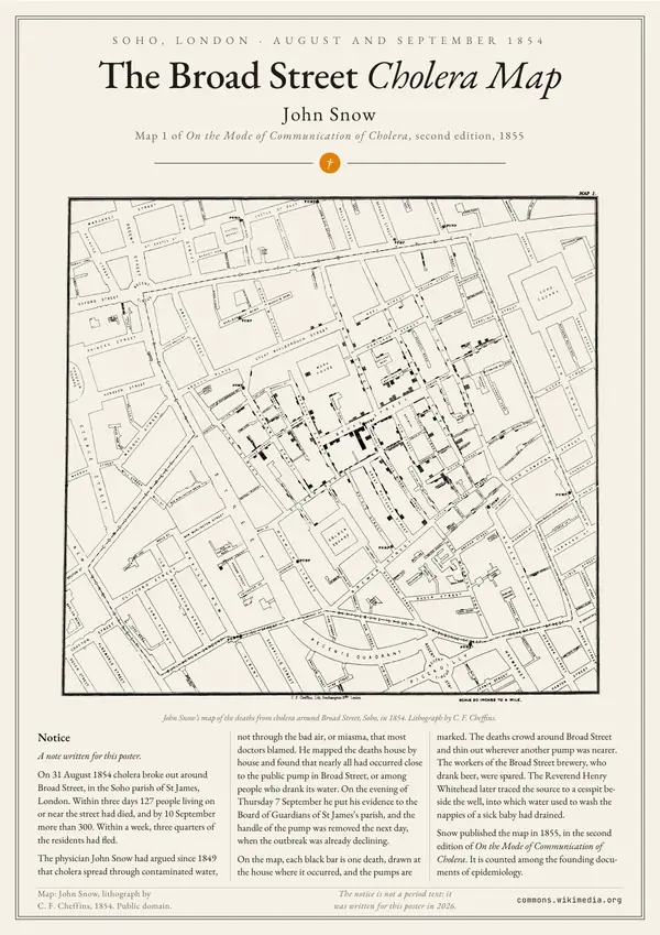
John Snow: the Broad Street cholera map
John Snow, 1854
John Snow’s map of the 1854 cholera deaths around Broad Street, which pointed to a single public water pump.
Print from A3
-
Historical data visualization
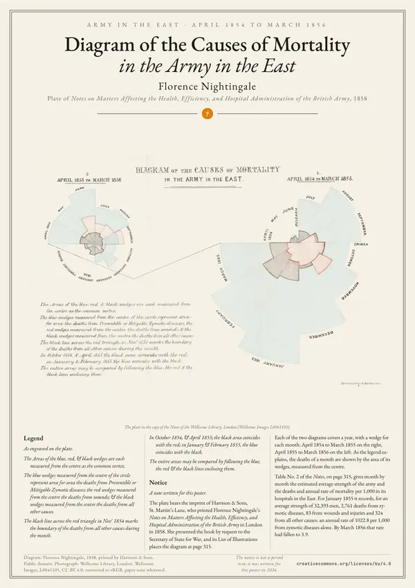
Florence Nightingale: Diagram of the Causes of Mortality in the Army in the East
Florence Nightingale, 1858
Florence Nightingale’s 1858 diagram of the British army’s monthly deaths in the East, from disease, wounds and other causes.
Print from A3
-
Historical data visualization
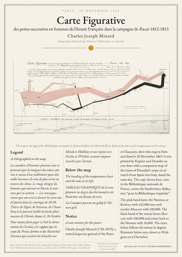
Charles Joseph Minard: Carte figurative des pertes successives en hommes de l’Armée Française dans la campagne de Russie 1812-1813
Charles Joseph Minard, 1869
Minard’s 1869 map of the French army in Russia in 1812-1813, its width drawn to scale of the men left.
Print from A3
-
Historical data visualization
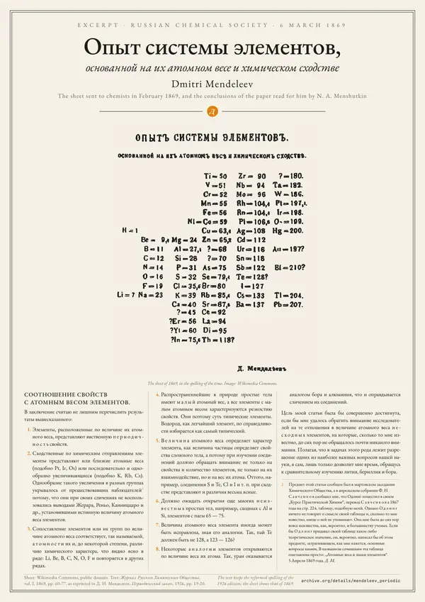
Опыт системы элементов, основанной на их атомном весе и химическом сходстве
Dmitri Mendeleev, 1869
Mendeleev’s system of the elements by atomic weight, sent to chemists in February 1869, with the conclusions of his paper.
Print from A3
-

Historical data visualization
Ernst Haeckel: Stammbaum des Menschen
Ernst Haeckel, 1874
Ernst Haeckel’s 1874 tree of the descent of man, from the Moneren to the Menschen, plate XII of his Anthropogenie.
Print from A3


